Makkah TV Rebranding & Broadcast Design | Animus Agency
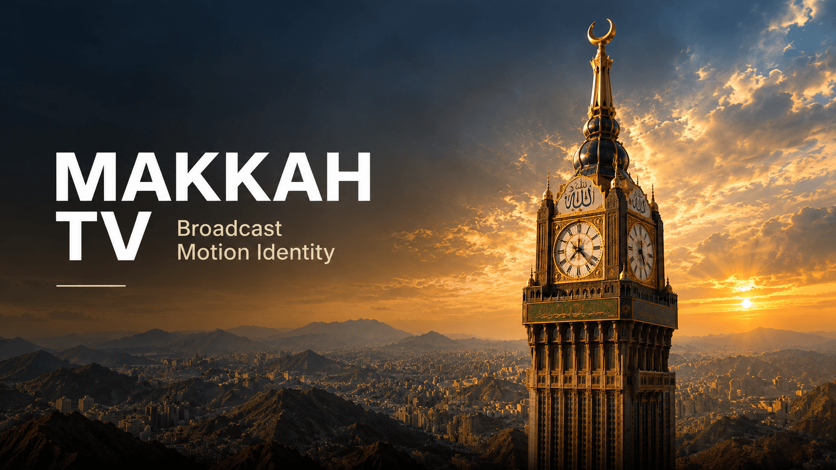
A complete broadcast identity created for Makkah TV, bringing its new visual direction to life through logo animation, cinematic motion design, intros, channel separators, and on-air graphics. Expressive painterly imagery and heritage-inspired details shaped a distinctive visual system built for Makkah TV’s daily broadcast.
Makkah TV Rebranding:
A Painterly Broadcast Identity Brought to Life
Animus Agency developed a complete on-air motion package for Makkah TV, bringing the channel’s new logo to life through animation, intros, outros, channel separators, and supporting broadcast graphics.
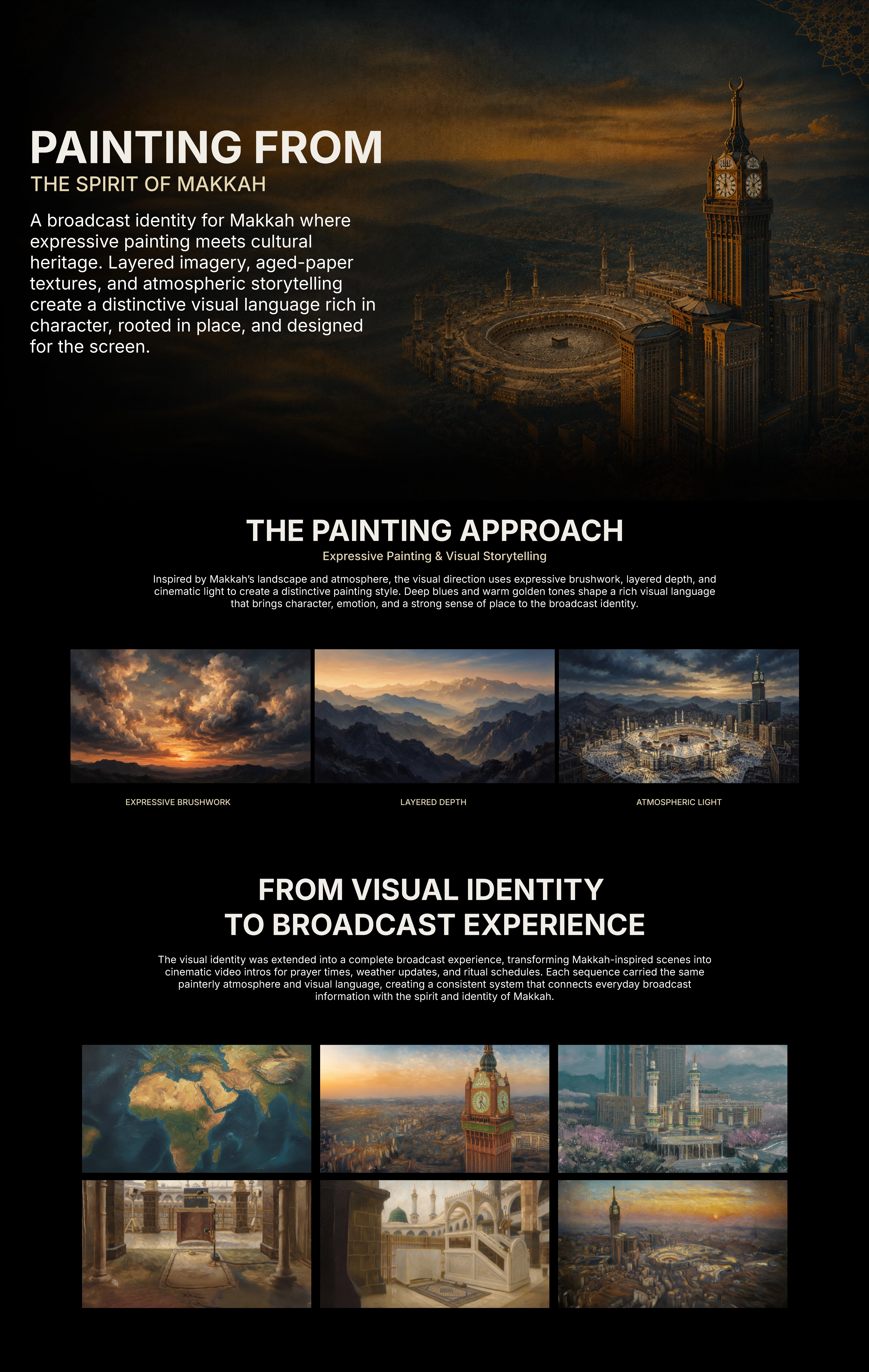
The creative direction combined aged-paper textures with expressive, Van Gogh-inspired artistry, giving the channel a distinctive visual character shaped by warmth, reflection, and a sense of heritage.
The package is now live on air, carrying the refreshed identity across the channel’s daily broadcast.
About Makkah TV
Makkah TV is an Arabic-language satellite channel focused on Islamic content, providing a space for faith-centered programming, learning, and reflection.
For a channel with this focus, presentation helps shape the atmosphere around the content. The moments that introduce a programme, connect segments, or communicate daily information all contribute to the viewing experience.
Our task was to create an on-air identity that supported that atmosphere while giving the channel a distinctive and cohesive visual presence.
From a New Logo to a Complete Broadcast Identity
Our work began after the creation of Makkah TV’s new logo.
The next step was to establish how that identity would move, appear, and connect across the broadcast. A logo provides a recognizable mark; a motion package extends it into the repeated moments audiences experience throughout the day.
Animus Agency developed the logo animation and expanded the visual direction across long, medium, and short intros and outros, channel separators, and supporting broadcast assets.
The result was a connected package designed to make the rebrand visible throughout the channel’s programming.
The Meaning Behind the Logo
The Makkah TV logo represents a top-down view of the Kaaba, surrounded by circular forms symbolizing believers gathering around it.
The large and small circles represent people from across the world, expressing the diversity of the believers who journey to the Kaaba and come together around a shared spiritual center.
This relationship between the central form and the surrounding circles gives the identity its meaning: people from different places, united by faith and drawn toward the same sacred destination.
For our motion work, this symbolism provided a meaningful foundation. Bringing the logo to life meant preserving the connection between the Kaaba at its center and the believers represented around it.

Bringing the Logo to Life
The logo animation became a central expression of the refreshed identity.
Our role was to translate the existing mark into motion, giving it a reveal and rhythm that belonged within the broader painterly direction while respecting its spiritual symbolism.
The Kaaba and the surrounding circular forms needed to remain recognizable as one connected composition. Their relationship carries the idea of believers from around the world gathering around a shared center of faith.
For a television channel, logo animation is also a recurring brand moment. It needs to remain clear through repeated viewing and feel connected to the material surrounding it.
The Makkah TV animation established that connection, creating a foundation for the intros, outros, and separators that followed.
The Creative Direction: Aged Paper Meets Expressive Painting
The visual approach brought together the tactile quality of old paper and the expressive character of painting inspired by Van Gogh.
Aged-paper textures introduced warmth and a sense of history. Painterly imagery added depth and visual movement, creating an artistic setting for the channel’s identity and content.
Together, these elements established a recognizable visual language that could extend across the package.
The creative challenge was to balance that richness with clarity. Texture and imagery needed to give the work character while leaving space for Arabic text, programme information, and the channel logo.
This balance connected the artistic direction with the practical requirements of television design.
A Complete Package for Different Broadcast Moments
The project extended across several types of on-air content, each with its own purpose and timing requirements.
Long, Medium, and Short Intros and Outros
We created opening and closing sequences in three duration categories.
The longer versions provided more room for the artistic direction to develop, while medium and short versions carried the same identity into more compact broadcast moments.
Across the different lengths, the package maintained a consistent relationship between imagery, texture, motion, and branding.
Channel Separators and On-Air Graphics
We extended the refreshed identity across a complete set of channel separators, content segments, and information graphics:
Asset | Arabic Title |
Quranic Verses | آيات قرآنية |
Hadith | أحاديث نبوية |
Poetry | أبيات شعرية |
Friday Sermon | خطبة الجمعة |
Prayer Times | مواقيت الصلاة |
Imam Schedule | جدول الأئمة |
Muezzin Schedule | جدول المؤذنين |
Weather Forecast | توقعات الطقس |
Each asset carried the same aged-paper textures and painterly visual direction, connecting spiritual content, programme transitions, and daily information within one consistent broadcast identity.
The Quranic verse, hadith, and poetry assets extended the artistic treatment into reflective content. Friday sermon graphics supported programme presentation, while prayer times, imam and muezzin schedules, and weather forecasts brought the identity into practical daily information.
This range required a flexible design approach: expressive enough to give the channel character, and clear enough to support information viewers need to read quickly.
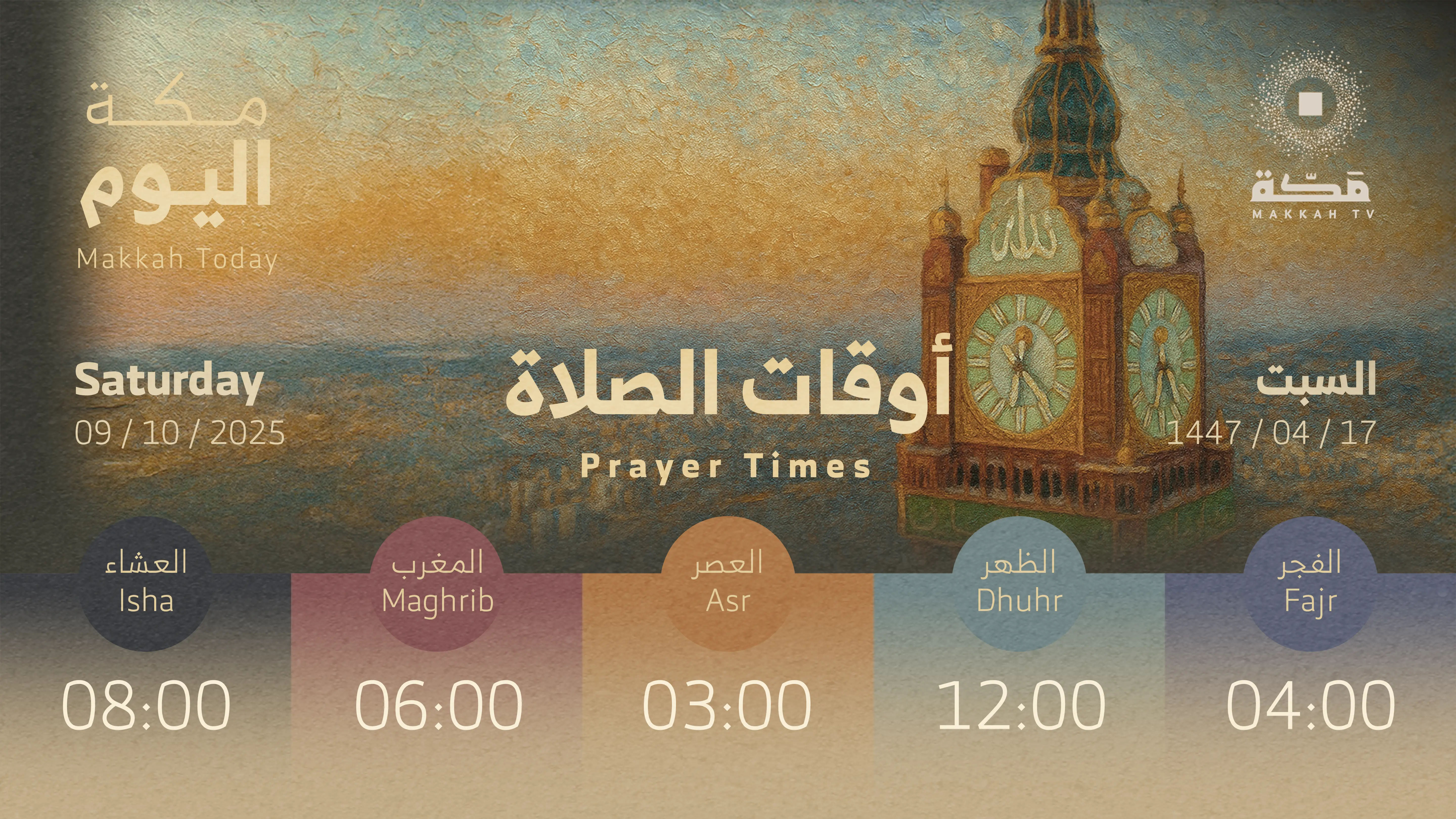
Prayer Times
The system includes dedicated motion graphics for prayer times. The format was designed with information hierarchy in mind, ensuring that key details remain immediately readable while the surrounding motion and visual treatment reinforce the overall identity.
The prayer-time graphics, for example, were treated as more than simple informational cards. They became part of the wider broadcast language through consistent typography, layout, transitions, and visual composition.
Visual
Motion
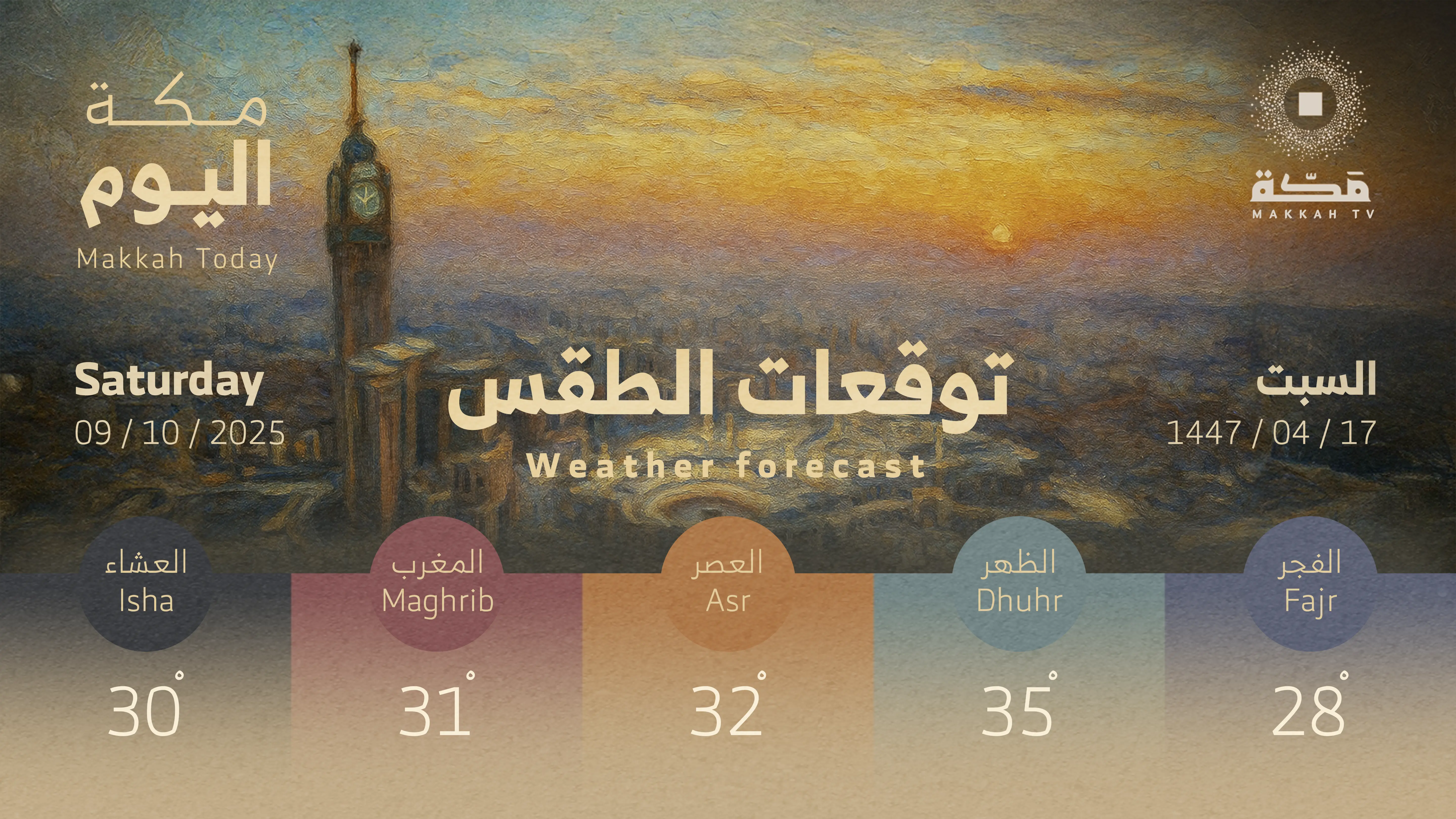
Weather Forecast
The system includes dedicated motion graphics for weather forecasts. The format was designed with information hierarchy in mind, ensuring that key details remain immediately readable while the surrounding motion and visual treatment reinforce the overall identity.
The same principle was applied to weather content, allowing different types of information to coexist within one recognizable visual system.
Visual
Motion
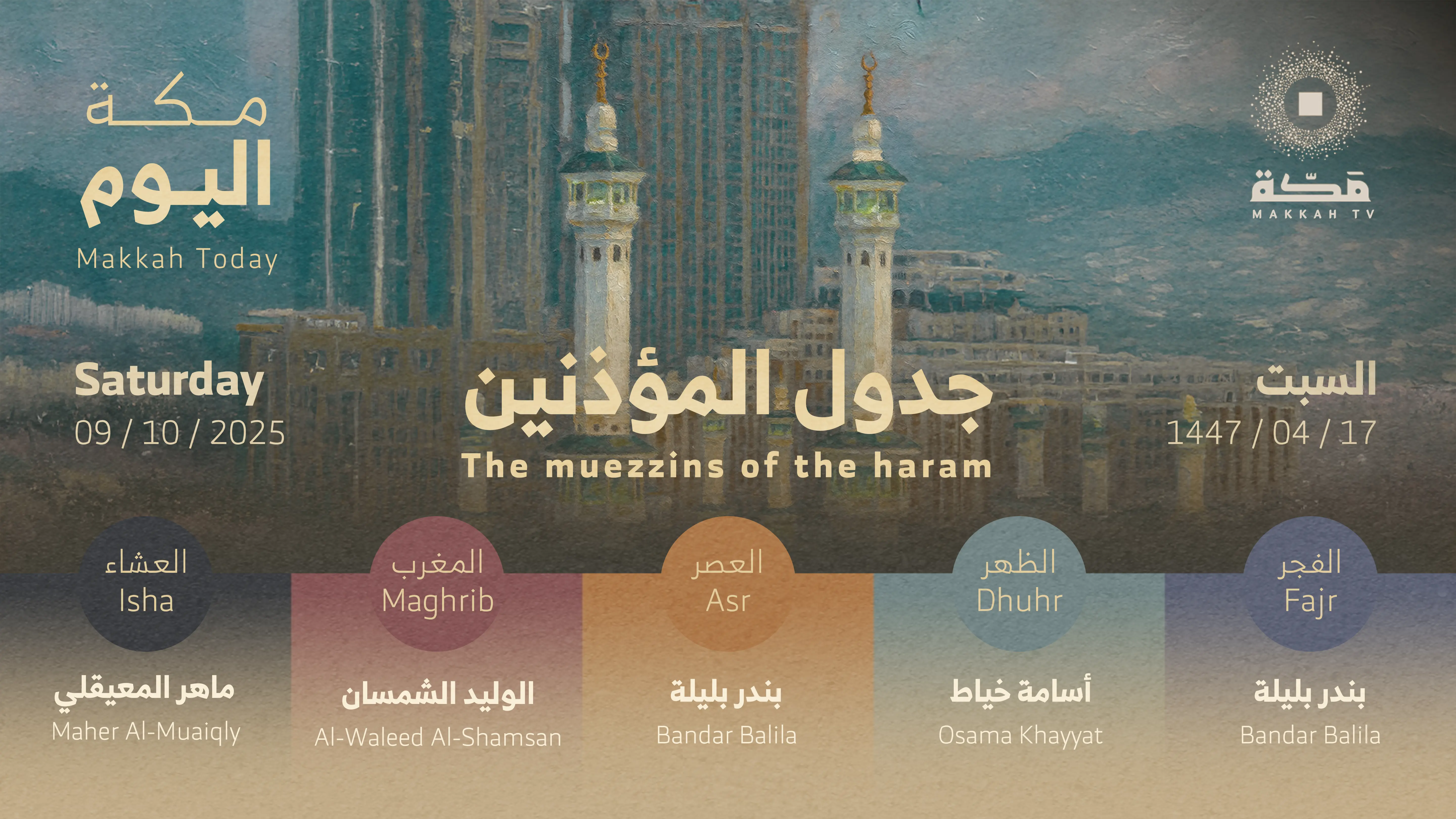
Muezzin Schedule
The system includes dedicated motion graphics for muezzin schedules. The format was designed with information hierarchy in mind, ensuring that key details remain immediately readable while the surrounding motion and visual treatment reinforce the overall identity.
The same principle was applied to schedules, allowing different types of information to coexist within one recognizable visual system.
Visual
Motion
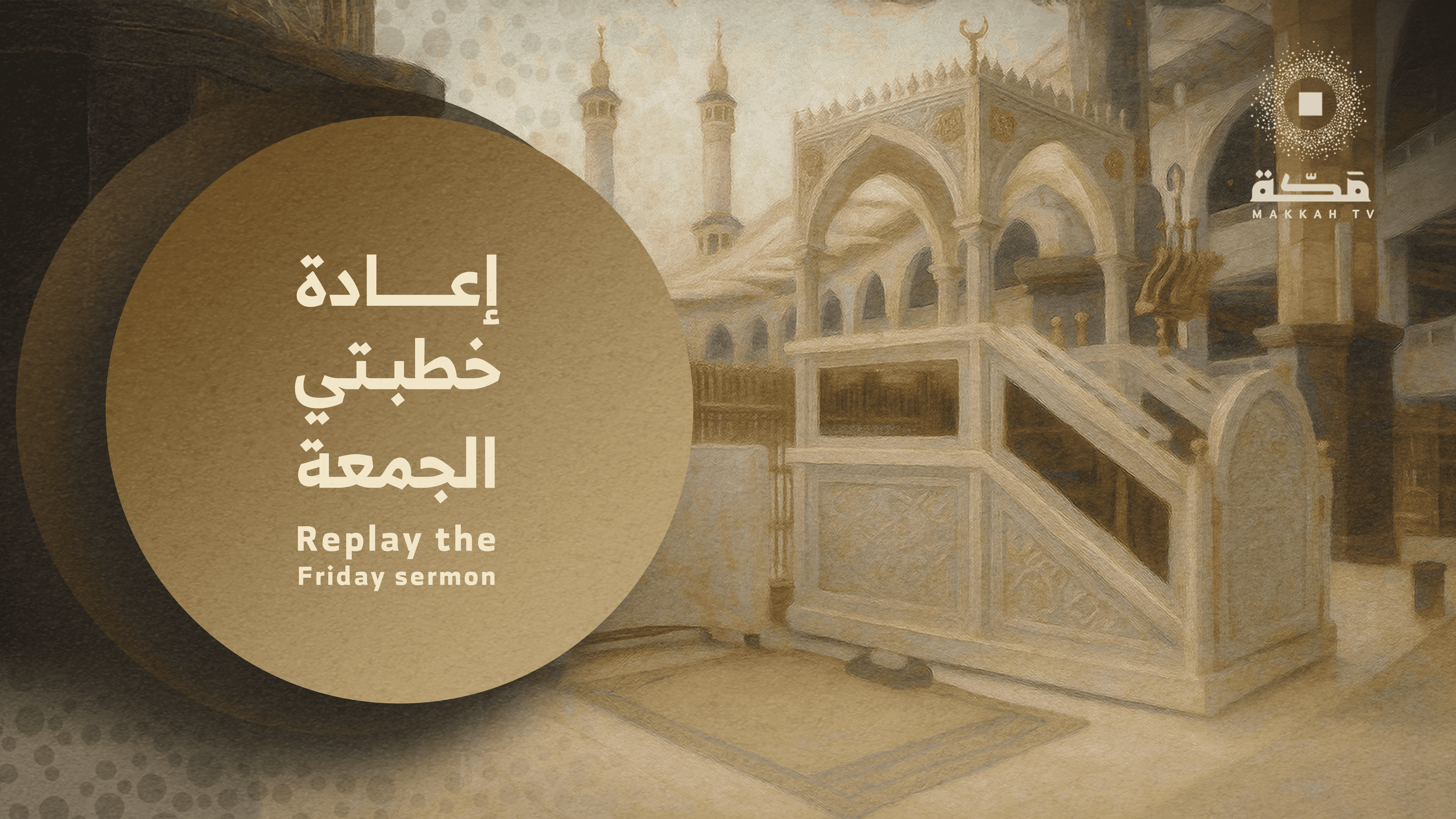
Friday Khutbah
The system includes dedicated motion graphics for Friday Khutbah content. The format was designed with information hierarchy in mind, ensuring that key details remain immediately readable while the surrounding motion and visual treatment reinforce the overall identity.
The same principle was applied to Friday Khutbah content, allowing different types of information to coexist within one recognizable visual system.
Visual
Motion
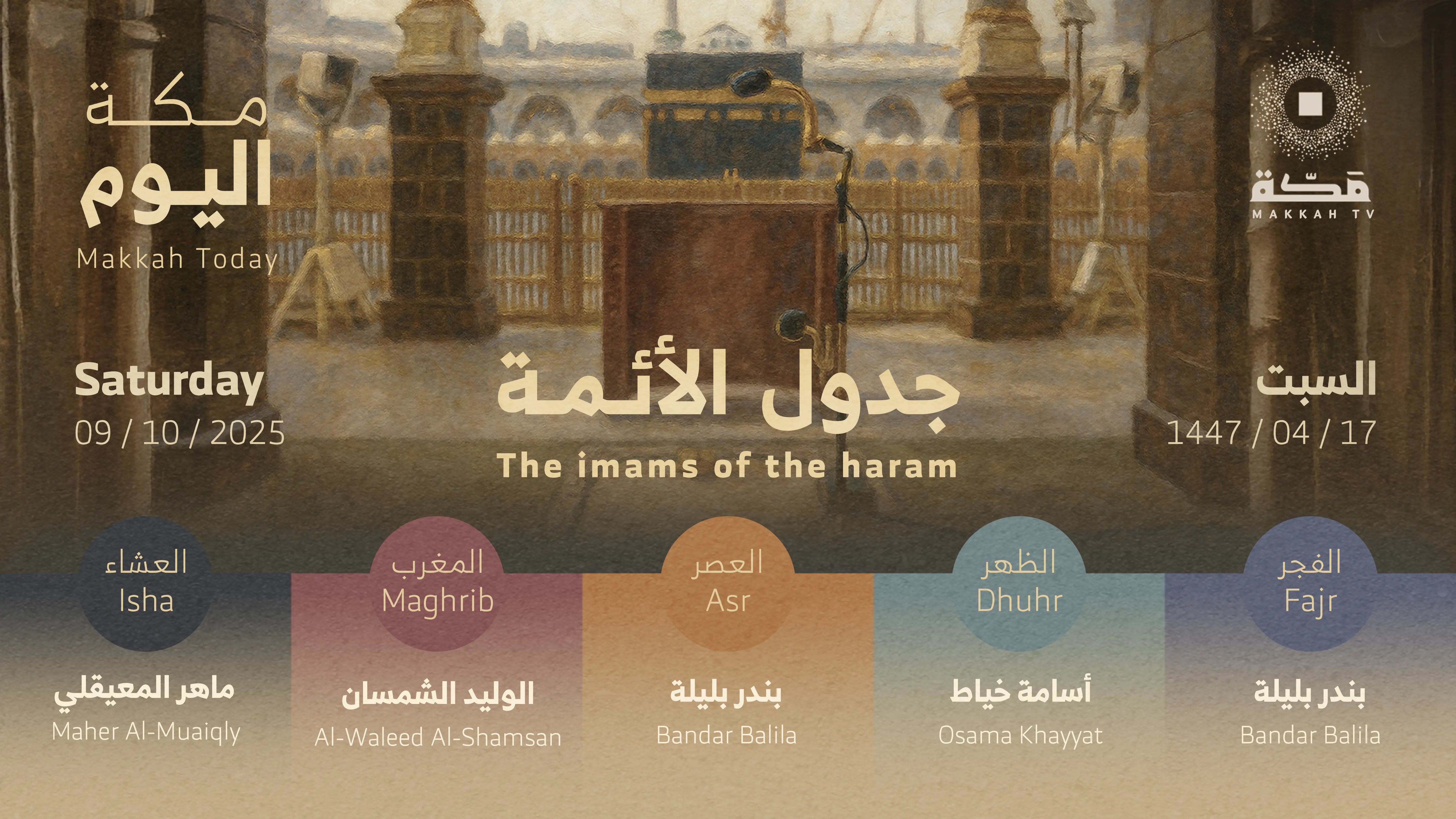
Imam Schedule
The system includes dedicated motion graphics for imam schedules. The format was designed with information hierarchy in mind, ensuring that key details remain immediately readable while the surrounding motion and visual treatment reinforce the overall identity.
The same principle was applied to schedules, allowing different types of information to coexist within one recognizable visual system.
Visual
Motion
Project at a Glance
3 Duration Categories | Complete Motion Package | Live on Air |
Long, medium, and short intros and outros | Logo animation, separators, and supporting broadcast assets | Implemented across the channel’s broadcast |
A Consistent Identity Across Daily Programming
A broadcast rebrand needs to work beyond its main introductory sequence.
The identity must remain coherent when it appears around a sermon, alongside a prayer schedule, or within a short channel separator. Those applications vary in pace and information density, but they still need to feel connected.
For Makkah TV, the aged-paper and painterly direction provided that connection. It gave the package a shared visual character while allowing individual assets to serve different editorial and broadcast needs.
The scope demonstrates the work involved in translating a creative concept into an extensive set of usable on-air materials from expressive brand sequences to recurring schedules and content graphics.
Creating the Visual Scenes
Alongside the broadcast interfaces, the project included a series of custom scenes created specifically for the video content. These scenes provided the visual foundation for the main motion pieces and helped establish a more cinematic dimension within the identity.
The scenes were developed to support the narrative and atmosphere of the broadcast experience, combining composition, visual effects, animation, and post-production to create richer moments beyond standard broadcast graphics. These visuals allowed the identity to expand from functional information design into a more expressive motion language.

From Identity to Broadcast Experience
The final outcome was designed to function as more than a collection of individual animations. It became a complete motion broadcast identity capable of connecting different types of television content under one visual direction.
From the opening TV intro and logo animation to prayer times, Friday Khutbah content, imam and muezzin schedules, weather forecasts, and supporting promotional graphics, every component contributes to a unified experience. The system balances clarity, elegance, motion, cultural character, and broadcast functionality, giving Makkah TV a contemporary visual presence while remaining aligned with the nature of its content.
The project demonstrates how motion design can transform a traditional broadcast identity into a living visual system one that is not only recognizable at first glance, but flexible enough to support the many different moments and information formats that make up a modern television channel.
Creative & Technical Execution
The project was developed through a combination of motion design, animation, compositing, visual effects, and video editing, with Adobe After Effects and Premiere Pro used as the primary production tools.
The focus throughout the process was on creating a balance between visual impact and communication, ensuring that every animated element had a clear purpose within the broadcast environment. The final system brings together identity, information, and motion into a cohesive experience designed to work seamlessly across Makkah TV's channel and digital touchpoints.
Live on Air, with a Positive Response
The new package is now in use on Makkah TV, bringing the refreshed identity into the audience’s everyday viewing experience.
The project received positive feedback following its introduction. Its clearest outcome is the implementation itself: the logo animation, sequences, separators, and supporting assets now form part of the channel’s on-air presentation.
For Animus Agency, this is a project we are proud of an opportunity to combine meaningful symbolism and expressive art direction with the consistency and practical detail required for a complete television identity.
Explore Animus Agency’s Makkah TV rebrand: meaningful logo animation, channel separators, and broadcast graphics with a distinctive painterly style.
Brand :
Agency :
Scope :
Industry :